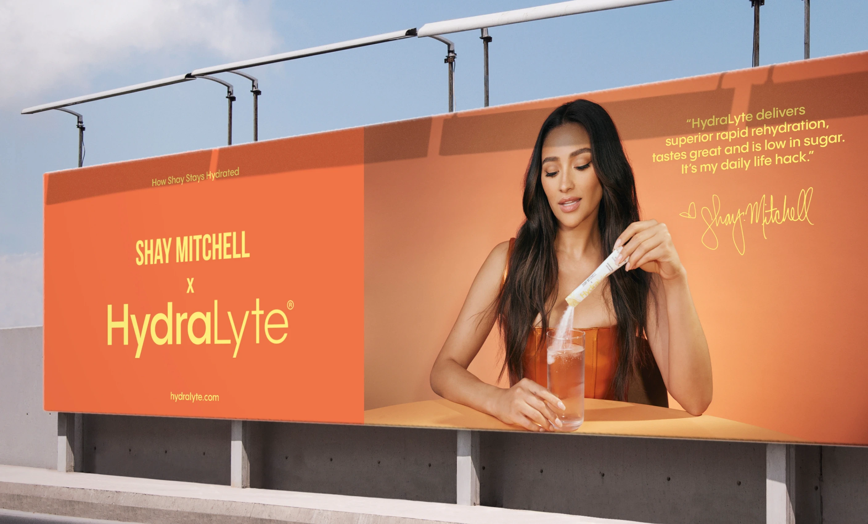
HydraLyte had a strong foothold in the hydration space with real science behind it and wide distribution to match. But as new competitors flooded the market, the brand risked getting lost in the crowd. It needed to become more recognizable, more memorable, and more emotionally engaging without losing its functional edge.
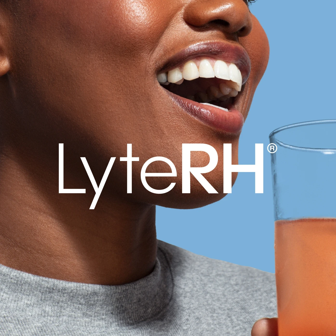
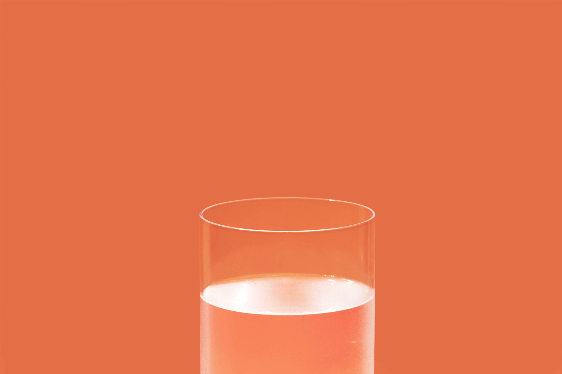
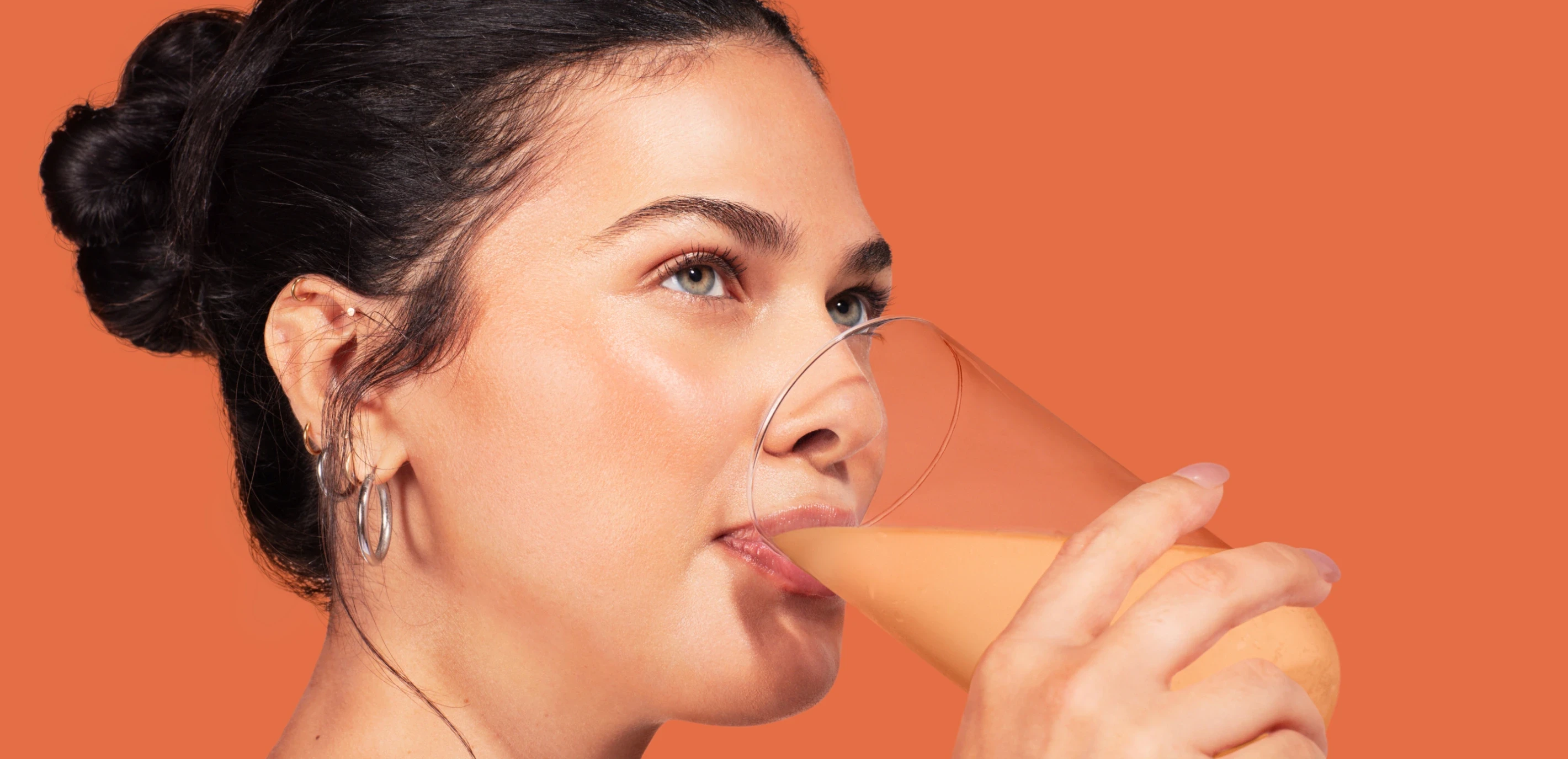
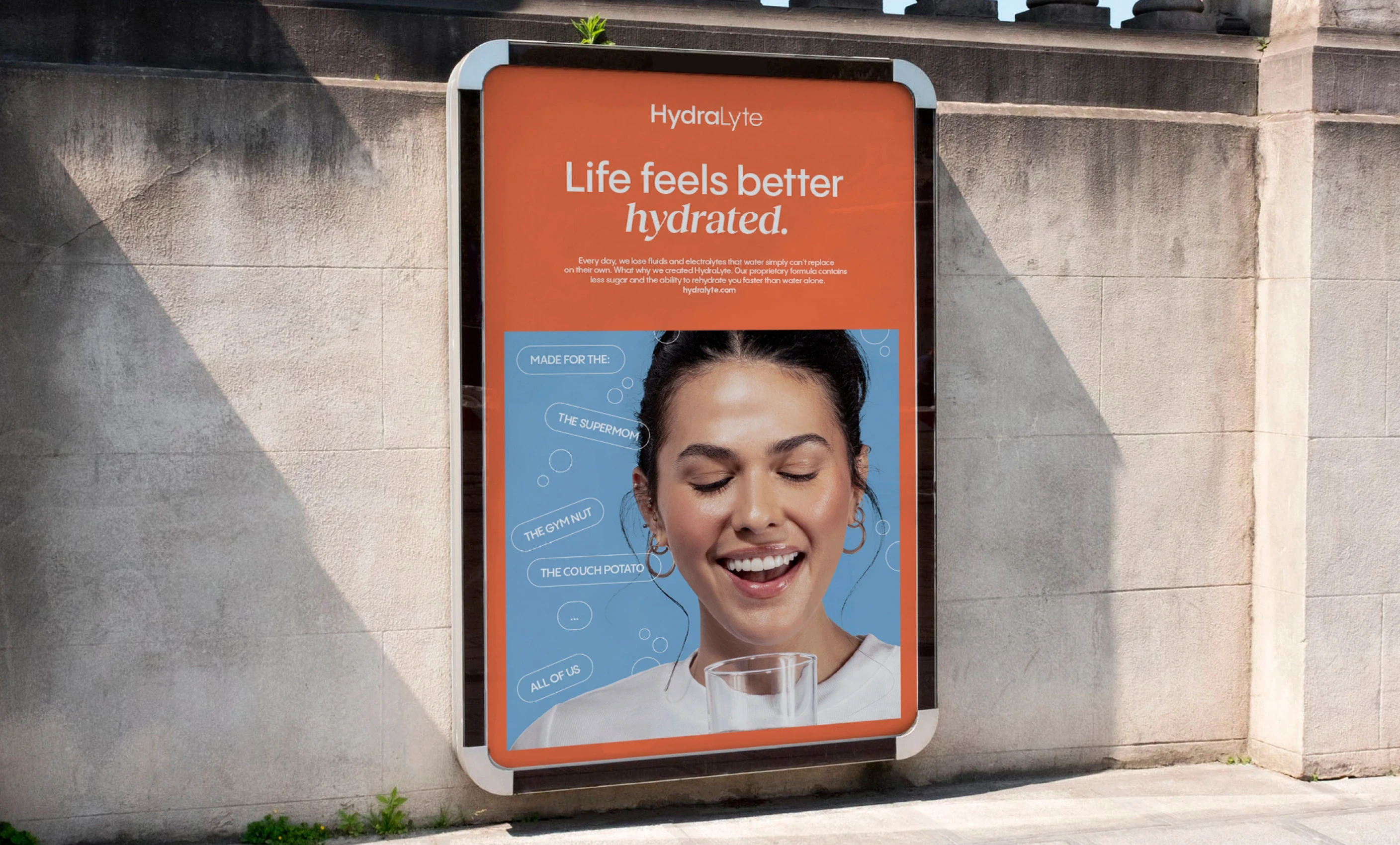
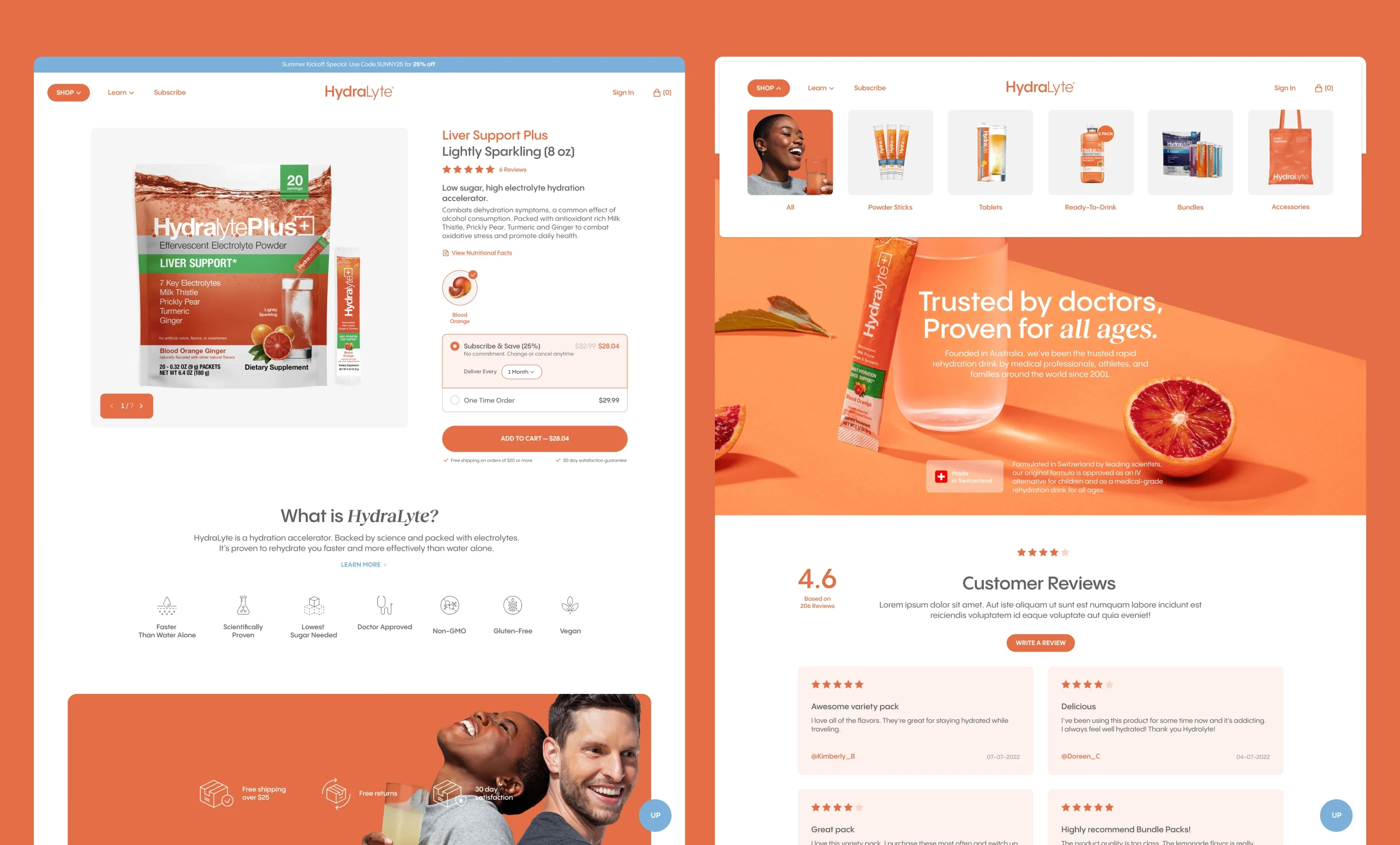
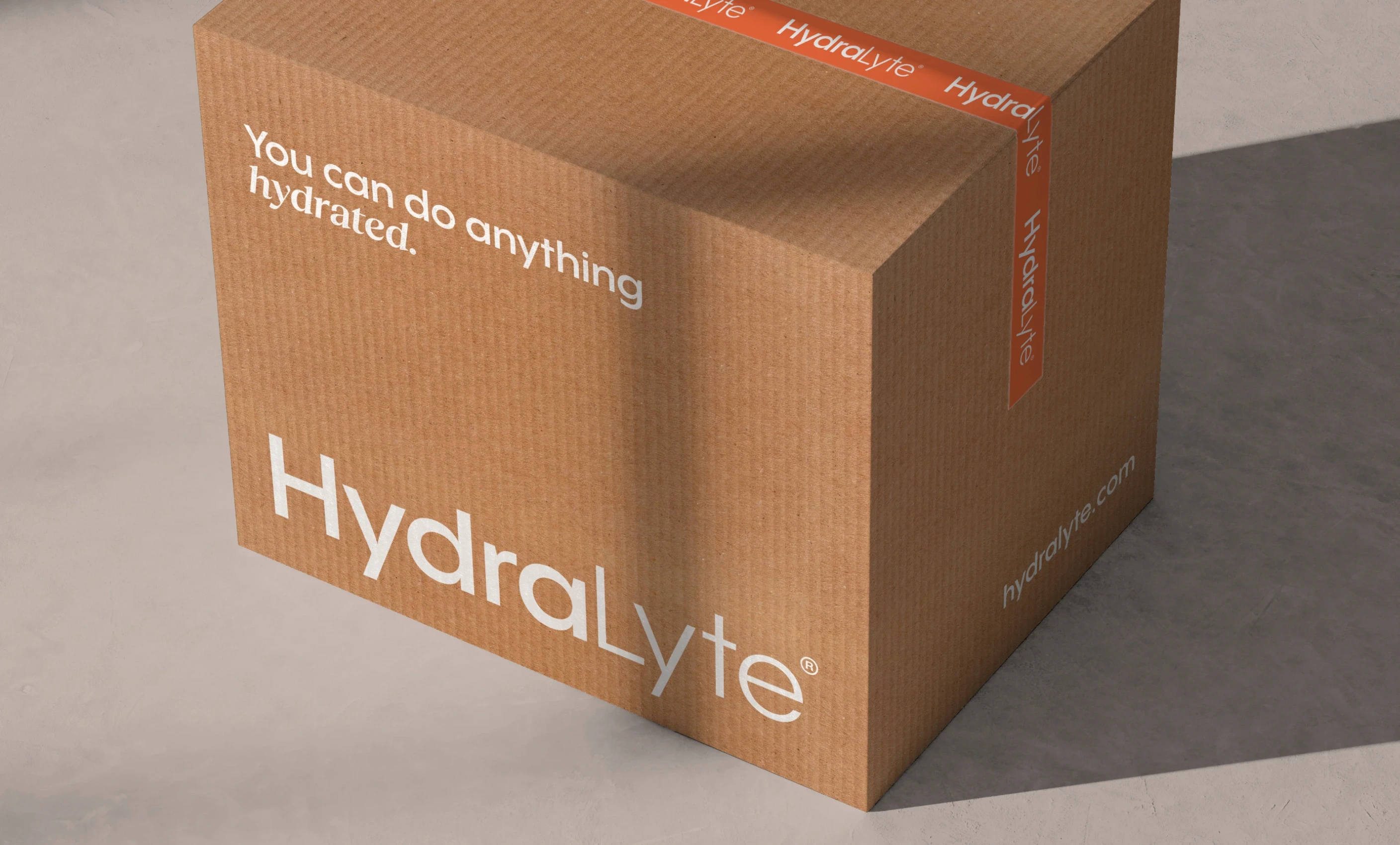
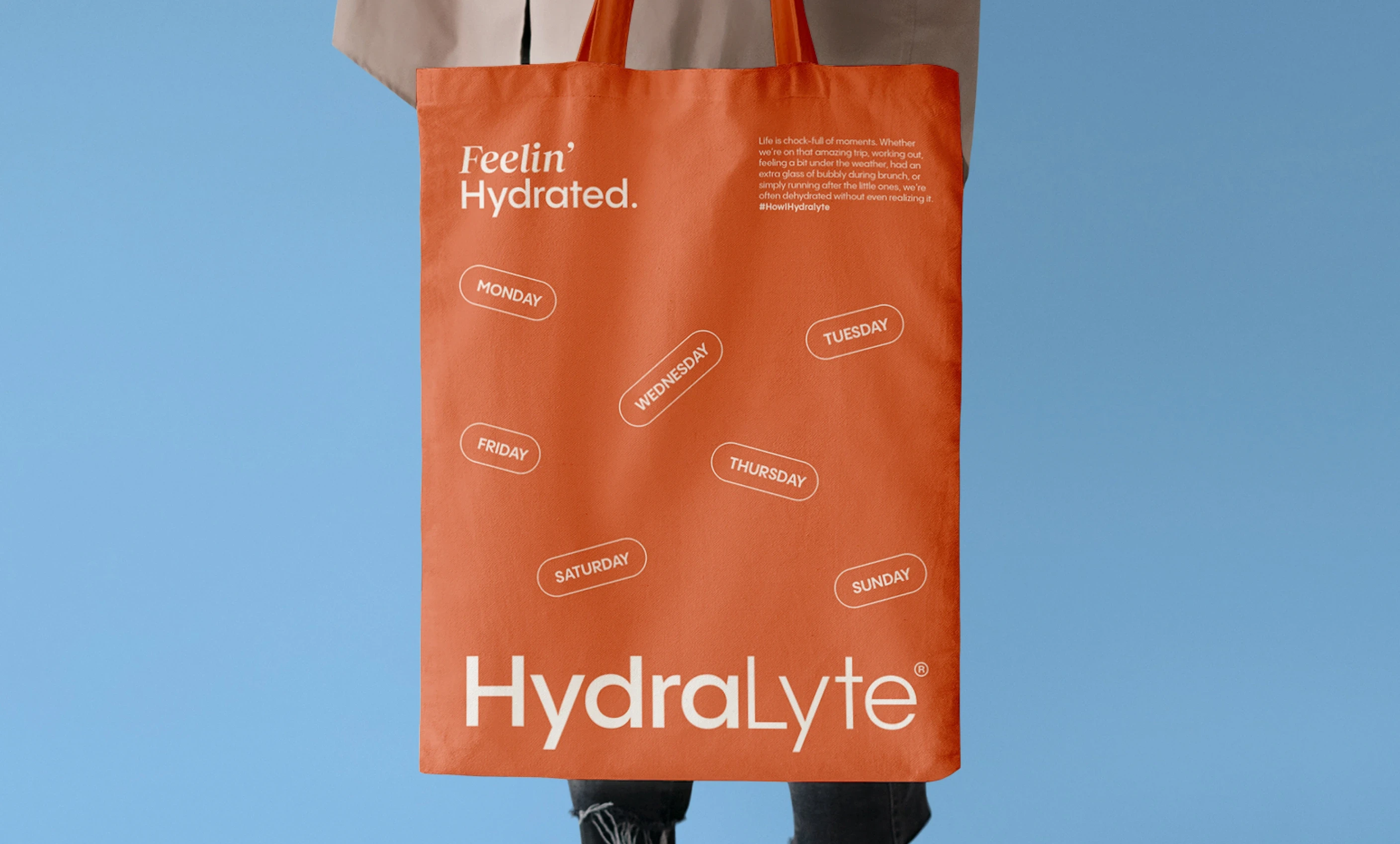
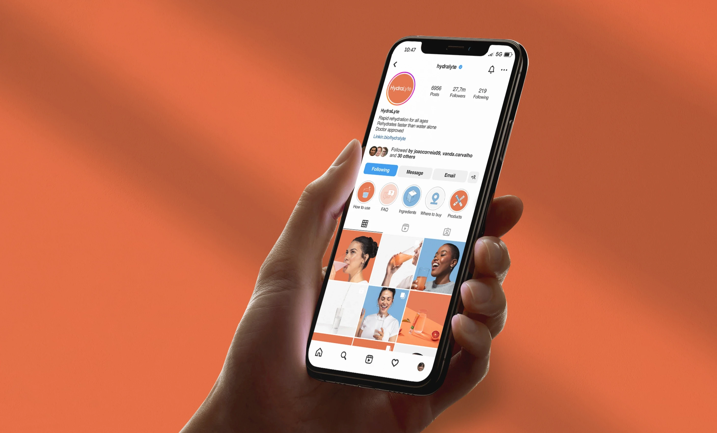
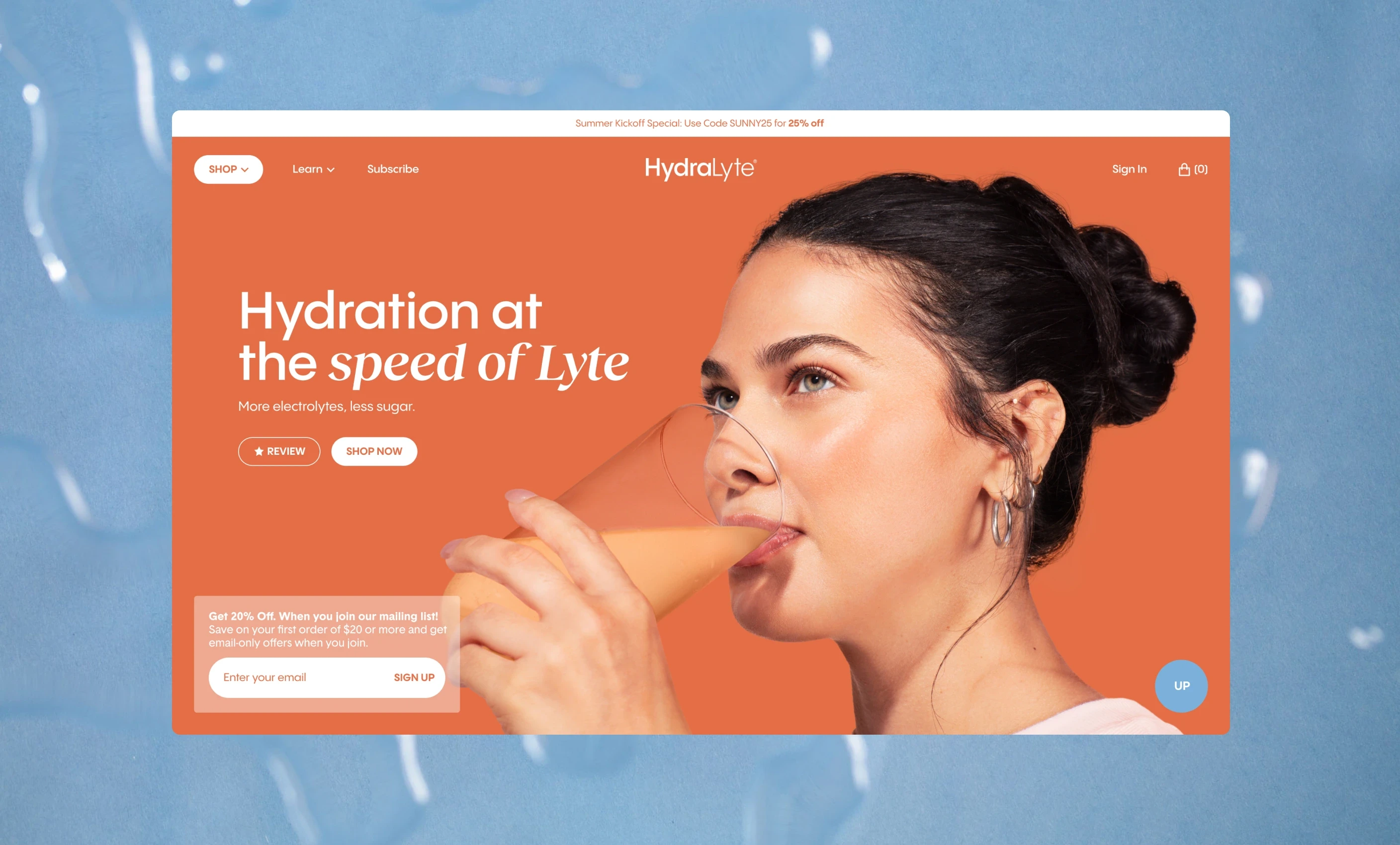
We rebranded HydraLyte to reflect what sets it apart: hydration that’s scientifically backed, refreshingly simple, and built for real life. We introduced a bold, cohesive visual system that brought consistency across packaging, digital, and retail. Graphic fruit photography added punch without feeling overly flavored, while playful illustrations brought in warmth and wit. We also refreshed the brand’s voice concise, optimistic, and rooted in science without sounding clinical. Anchored by the line “Hydration at the speed of Lyte,” the new HydraLyte balances function and feeling finally standing out as the smart, modern hydration brand it’s always been.
Next projects.
(2016-25©)